01
Overview
The Problem
Design decisions were being made independently across a small, remote team with high individual ownership. While this allowed work to move quickly, it led to inconsistent UI patterns and fragmented interaction decisions across the platform.
Why It Mattered
Without shared standards, previously solved problems were revisited repeatedly. Designers spent time debating patterns, engineers implemented variations of similar components, and the product experience became harder to reason about and maintain.
Who This Affected
Designers working asynchronously, engineers implementing UI decisions without clear guardrails, and leadership relying on a platform that lacked a consistent, cohesive experience.
Success Criteria
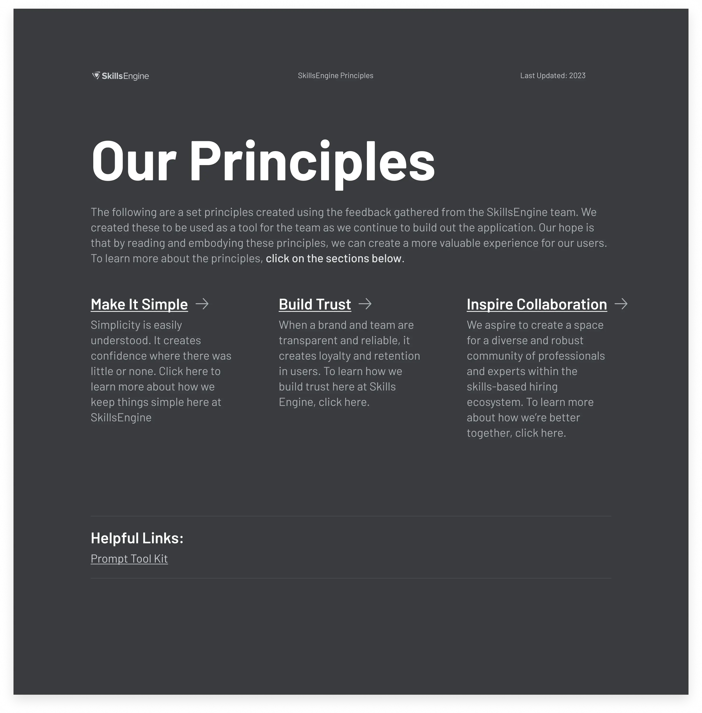
- Establish a shared set of design principles
- Improve UI consistency across the platform
- Streamline design critiques and decision-making
- Create alignment across design, product, and engineering
02
Approach
Naming the problem honestly
We recognized that inconsistency wasn't caused by poor design quality, but by a lack of shared decision-making guardrails. Designers were moving quickly and independently in a remote, Shape Up–style environment, which optimized for ownership but allowed patterns to drift over time.
Design for shared authorship
Rather than defining principles in isolation, we brought the team into the process. Adoption would only happen if the principles reflected how people actually worked and felt ownership over the outcome.
We facilitated a two-day onsite workshop with designers, product partners, engineers, and leadership. Activities were structured to surface preferences, expose disagreements, and make implicit assumptions explicit around tone, interaction patterns, and accessibility.
Synthesize into usable constraints
Following the workshop, Maria and I synthesized the output into a small set of clear, opinionated design principles. These were not aspirational values. Each principle was written to guide real decisions and provide language teams could use during critique and implementation.
The principles were documented in Figma to ensure visibility and ease of reference, and were introduced directly into design discussions rather than treated as static documentation.
Reinforce through practice, not process
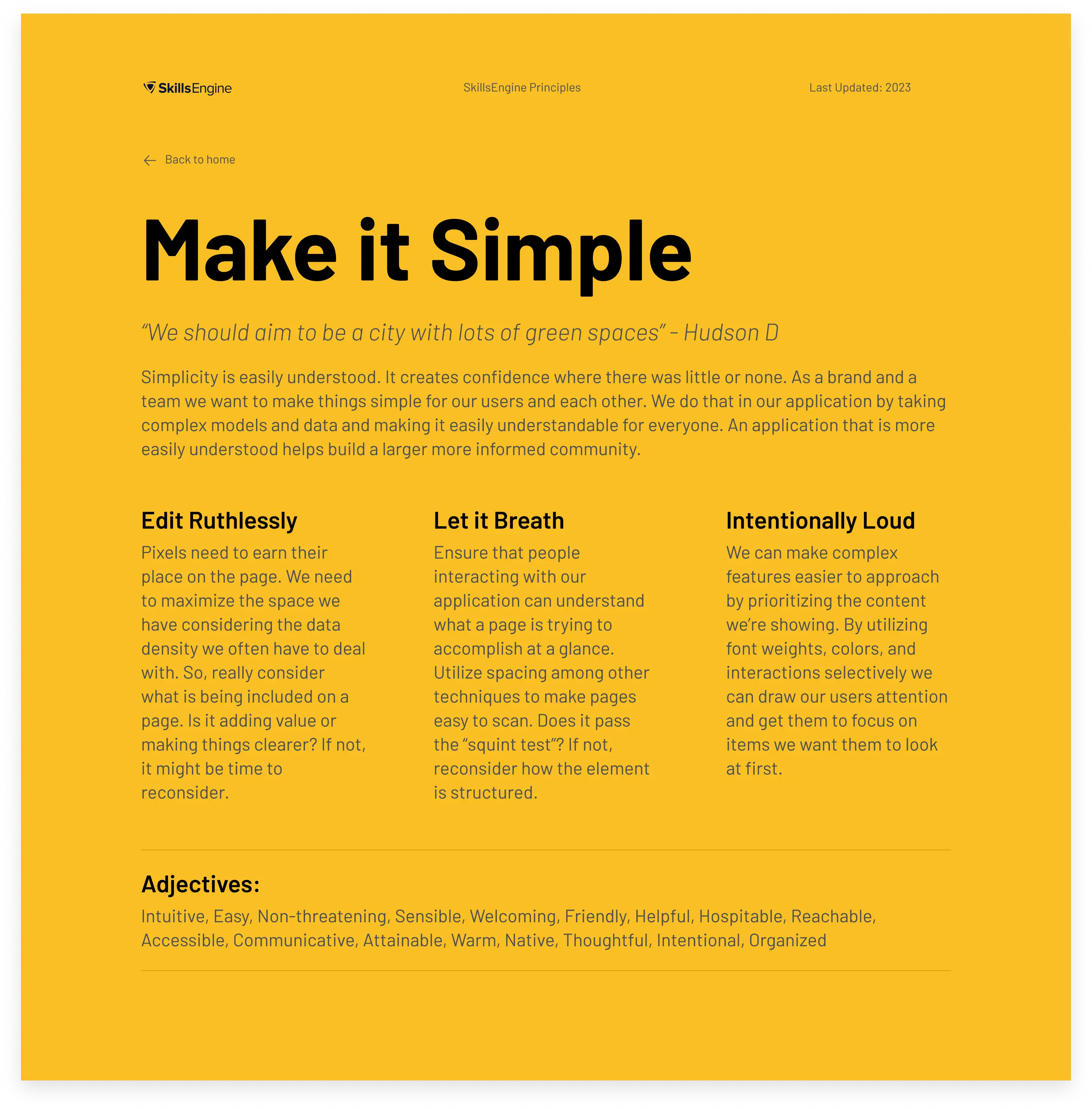
The goal was not to standardize output, but to standardize how decisions were made. Teams were encouraged to reference principles explicitly in critique and review. Over time, phrases like "Edit Ruthlessly" became shared shorthand, reducing debate, speeding alignment, and allowing designers to maintain autonomy without re-litigating foundational choices.
03
From Workshop to Working System
Turning principles into decisions
The real test of the principles was whether they could resolve real design problems. We intentionally applied them to active work rather than treating them as abstract guidance.
One early example was a data-dense table used throughout the platform. Over time, the table had accumulated controls, icons, and edge-case behaviors that made it difficult to scan and intimidating to use. Designers and engineers had different opinions about what should stay, what could be hidden, and what was "required."
Using the Edit Ruthlessly principle, we reframed the conversation. Instead of debating individual elements, we asked whether each control earned its place in the default view. Secondary actions were progressively disclosed, visual noise was reduced, and the table became easier to read without removing functionality.
The principle provided a shared rationale, allowing the team to move forward without prolonged debate.
Accessibility as a shared responsibility
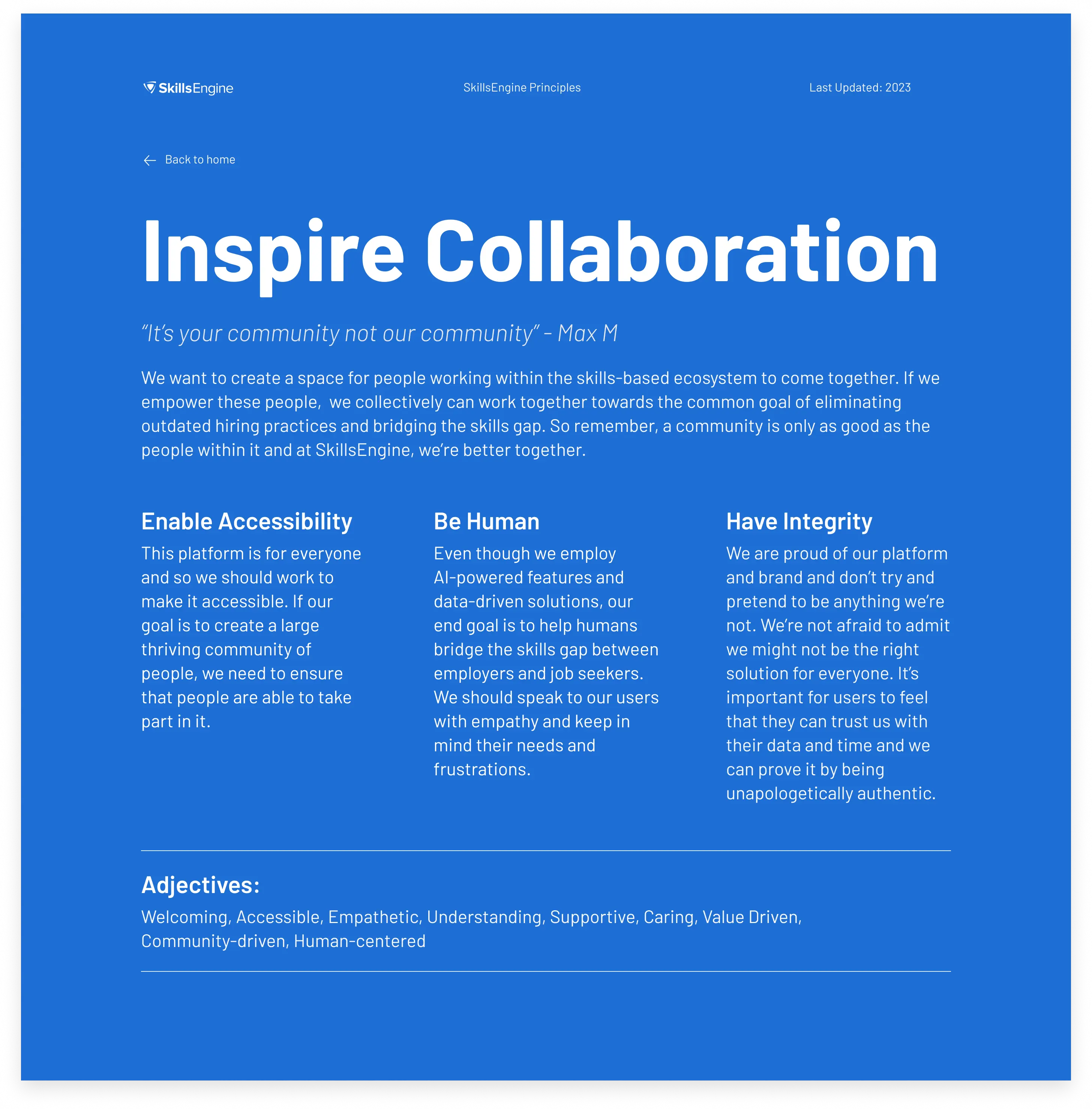
Accessibility had historically been treated as a best effort rather than a standard. By explicitly including Enable Accessibility as a core principle, it became part of how work was evaluated, not an optional enhancement.
This shift showed up in small but meaningful ways. Designers began calling out keyboard navigation and focus states earlier in the process. Engineers proactively added ARIA labels and tab controls, including in tools like the validation survey flow where accessibility had previously been overlooked.
Because accessibility was framed as a principle rather than a checklist, it became easier to advocate for and harder to ignore.
Creating shorthand for critique
Over time, the principles changed how critique worked. Feedback became faster and more focused. Instead of subjective reactions, conversations referenced shared language.
Questions like:
- "Is this edited ruthlessly?"
- "Are we introducing unnecessary variation here?"
- "Does this meet our accessibility standard?"
helped teams course-correct quickly while preserving individual ownership. Designers still made decisions independently, but they did so within a shared system that reduced friction and rework.
.webp)
"Chris is a design leader with a strong systems-thinking approach, driving user-centered research, strategy, and design on complex projects. He fosters team culture through continuous improvement, mentorship, and enthusiastic collaboration. Any team would be fortunate to have him."
04
Reflection
This project reinforced that consistency is rarely a tooling problem. In distributed teams with high autonomy, drift is natural. Designers move quickly and make thoughtful decisions, but without shared guardrails those decisions accumulate in different directions.
The goal was not to reduce ownership, but to support it. By introducing shared principles and language, alignment became easier, critique became faster, and accessibility became part of how work was evaluated rather than an afterthought. Designers retained independence, but operated within a system that reduced rework and unnecessary debate.
Ultimately, this work strengthened my belief that design leadership is less about enforcing standards and more about creating conditions where teams can move quickly while still building something coherent.